Imagine this totally crushing scenario. You are sitting in your spacious office, staring at a retina screen. You are looking at a 3D art toy model that took six grueling months to perfect. That signature “cyberpunk neon pink” looks absolutely stunning. It perfectly matches your brand’s soul. You confidently send the Pantone codes to the manufacturer and happily pay the prototyping fee.
Weeks pass, and a package crosses the ocean to land on your desk. You tear it open, heart racing. And then, dead silence. That futuristic neon pink now looks like a faded piece of plastic left in the sun for three years. It is a dull, unappetizing liver color. Honestly, you probably want to smash your desk right about now.
“Are the factory workers blind?”
You what? I hear this exact same desperate yelling every single day on overseas calls. You are definitely not alone in feeling this frustration. Whether you are a brand-new indie artist or a massive toy brand, almost everyone hits a brick wall with “color” during their first mass production run.
Let me explain. Taking the color you see on a computer screen and replicating it 1:1 onto a physical piece of PVC plastic is not as simple as hitting “Ctrl+C” and “Ctrl+V”. It is a brutal battle of chemistry, optics, and human vision. Today, we are going to tear open the technical black box of PVC color matching. I will show you exactly how to get that flawless color you are dreaming of.
The Screen’s Lie: Why Your MacBook Tricked You
We have to start by clearing up a fundamental physical gap: the clash between things that emit light and things that reflect it. When you design an art toy, your computer screen uses the RGB (Red, Green, Blue) color model. Your monitor is essentially a powerful flashlight beaming directly into your eyes. With that backlight, colors show off insane saturation, brightness, and clarity.
But when you hand that design to a factory, we use physical paints. Whether it is CMYK or a specific Pantone spot color, these are reflective surfaces, not light sources. They rely entirely on absorbing some ambient light and bouncing the rest back to your eyes.
Think of it like trying to translate a beautiful French poem into Japanese. Without some extremely clever localized tweaking, the subtle emotional hints will get lost. You just cannot demand a non-glowing piece of PVC plastic to hit the “neon” brightness of a maxed-out monitor, unless we sneak a tiny LED bulb inside it. Acknowledging this physical difference is the very first step to avoiding endless arguments later.
PVC’s “Bad Temper”: It Is Not a Blank Canvas
A lot of creators naturally assume that painting a toy is as easy as painting on a white piece of paper. You buy the right paint color, spray it on, and you are done. If it were that simple, factories would not pay top dollar for master color mixers with twenty years of experience.
Polyvinyl Chloride (PVC), in its raw, unpainted state, is not pure white at all. It usually has a slightly muddy grey-yellow or slightly cyan tint. To make things even more frustrating, we have to mix chemicals called plasticizers into the raw material to make the PVC feel soft and slightly bouncy like human skin.
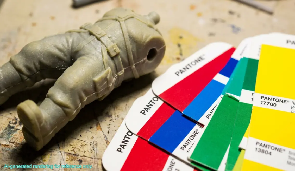
These chemicals make the PVC surface incredibly “picky”. If you spray a bright yellow paint directly onto a bare, greyish-yellow PVC figure, that underlying grey will immediately bleed through the thin paint layer. Your vibrant yellow instantly turns into a lifeless, dirty mustard color. It is like trying to paint with watercolors on brown craft paper; it never looks clean.
It gets worse. The chemical molecules in specific red or blue pigments can actually react with the plasticizers inside the PVC over time. This causes the color to bleed outward or change completely. This is the dreaded “color migration” phenomenon that absolutely terrifies the industry.
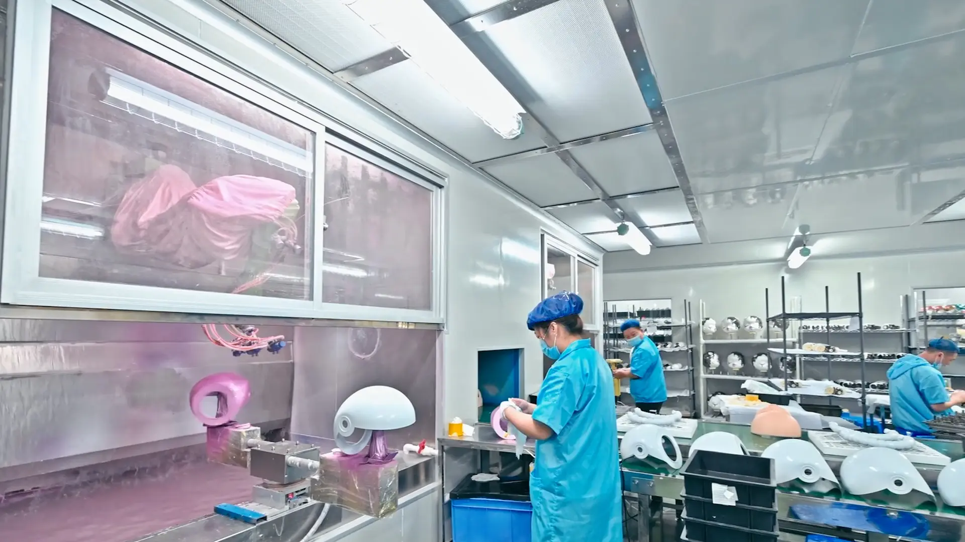
To stop this disaster, we have to perform a time-consuming but absolutely mandatory step before spraying the final Pantone color: applying a primer. We use a highly adhesive neutral white or light grey primer to completely seal the pores of the bare PVC. This blocks the plasticizers and provides a genuinely clean “blank slate” for the actual colors.
Fighting “Metamerism”: The Ghost in the Light Trap
Now, let’s talk about the biggest troublemaker that causes clients and factories to point fingers at each other. It is called “metamerism”. That sounds like heavy academic jargon, but a daily life analogy will clear it right up. Have you ever bought a jacket at the mall that looked completely black, but when you wore it out in the sun the next day, you realized it was actually dark blue?
That is metamerism. It happens because different light sources (sunlight, incandescent bulbs, LED fluorescents) contain completely different color spectrums. In overseas toy manufacturing, this causes tragedies all the time. A factory worker in Shenzhen stands under a cheap, slightly green fluorescent light. They compare the freshly painted toy to a Pantone card, think it looks like a “perfect match,” and snap a photo for the client in London. Meanwhile, that client is sitting under a warm yellow desk lamp, looking at their phone screen, and thinking the color is totally wrong.
Who is actually right?
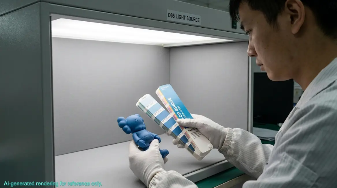
The point is, we cannot rely on random light sources. On our standardized painting assembly line, we strictly ban any “gut feeling” color checking. All of our color approvals must happen inside a specialized machine called a Light Booth. We compare everything uniformly under a D65 standard light source. D65 is a special tube that simulates international standard artificial daylight, with a color temperature around 6500K. Only when the paint and the physical Pantone card look identical under D65 light does the paint job pass the test. We will never judge a color’s fate on a rainy day or in a dim hallway.
The Topcoat’s Betrayal: Glossy, Matte, and Rubber Textures
Alright, let’s assume our master mixer nailed your requested Pantone 186C Red perfectly. The paint is on, and it looks flawless inside the light booth. Are we totally done? Hold on, the easiest place to mess up is still waiting for us. Art toys look premium because of that final, transparent protective layer called the topcoat. You might want a reflective glossy finish, a highly textured matte finish, or a flocked/rubberized paint that feels like a peach.
These transparent protective coats will ruthlessly betray the exact color you worked so hard to mix.
When you spray a matte topcoat, it creates microscopic bumps on the surface. These tiny particles scatter the incoming light in every direction, which is called diffused reflection. To your eyes, the color instantly gets lighter and greyer, as if it is covered in a faint fog. A bright red might suddenly look like a washed-out pink after a matte spray.
On the flip side, if you spray a high-gloss topcoat, the light hits it with a concentrated specular reflection. This immediately makes the underlying color look much deeper, richer, and highly saturated.
How do our engineers handle this nightmare? We use something called “predictive deviation compensation”. If we are making a toy with a final matte finish, the veteran color mixer will intentionally make the underlying base paint slightly darker and more vibrant than your requested Pantone card. When that base color looks technically “wrong,” we spray the matte topcoat over it. A magical chemical reaction happens: that hazy diffused reflection pushes the overly vibrant base color right back to the exact, perfect shade you originally asked for。
The Ultimate Anti-Pitfall Guide for Creators and Brands
After throwing all these hardcore factory secrets at you, what exactly should you, the client, do? How do you protect your IP’s visual vibe throughout this long, complex process? I have put together a few highly effective, field-tested rules for you:
Frequently Asked Questions (FAQs)
- How do I choose between Pantone Coated (C) and Uncoated (U) cards for PVC toys? In the plastic toy manufacturing industry, always default to the Pantone Solid Coated (C) card. The C card is printed on glossy coated paper, and its color saturation and reflectivity closely mimic how paint physically behaves when sprayed onto PVC or ABS plastics. The U card is meant for uncoated paper and looks too dull for art toy color matching.
- Why do my PVC art toys fade or discolor after sitting in a display cabinet? Fading usually happens for two reasons: the factory used cheap, low-quality paint lacking UV resistance (causing pigment molecules to break under sunlight), or excess cheap plasticizers inside the PVC are leaking out over time and reacting chemically with the paint. Partnering with a reputable OEM factory that uses high-quality, eco-friendly paints is the only way to avoid this.
- Can the factory match the toy color directly from my computer’s digital Hex code (like #FF5733)? We highly advise against doing this. Hex codes are digital values designed specifically for emissive screens using the RGB color model. The exact same Hex code looks completely different depending on the computer monitor. You must convert your digital colors into physical Pantone color codes so the factory has a real-world standard to mix against.
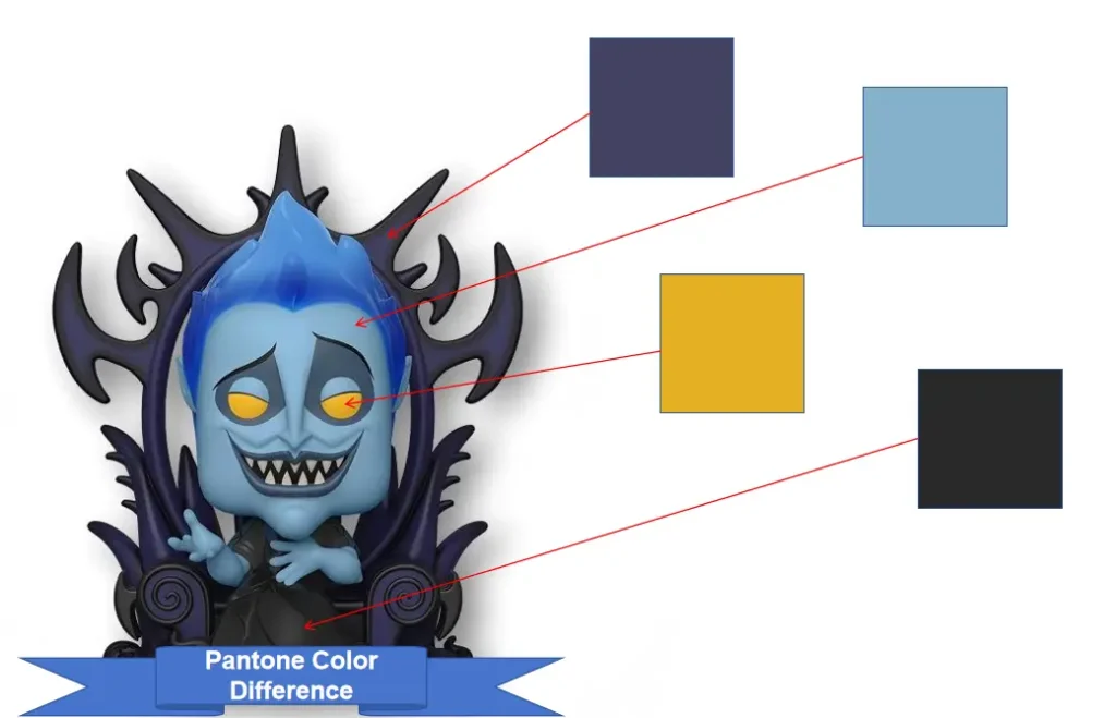
- What exactly is a “Paint Master” in designer toy manufacturing? A Paint Master is the very first physical sample where the final colors and surface treatments are hand-painted to absolute perfection by senior factory artisans. Once approved and signed by the client, this master sample sits on the assembly line as the ultimate physical standard for all mass production workers and quality control teams.
- Will adding a glow-in-the-dark effect change the original base color of my PVC toy? Yes, it will. Glow-in-the-dark powder naturally carries a slightly cloudy pale yellow-green or greyish-white tint. When mixed into clear topcoats or colored paints and sprayed onto PVC, it inevitably makes the toy’s daytime base color look slightly muddy or less saturated. Engineers typically have to forcefully compensate for this color shift by adjusting the brightness of the underlying paint.